 by Savi3
Delivering high-quality software is no longer just the responsibility of QA teams — it’s a shared goal across development, product, and platform engineering. But how do you measure quality effectively and act on it in real time?
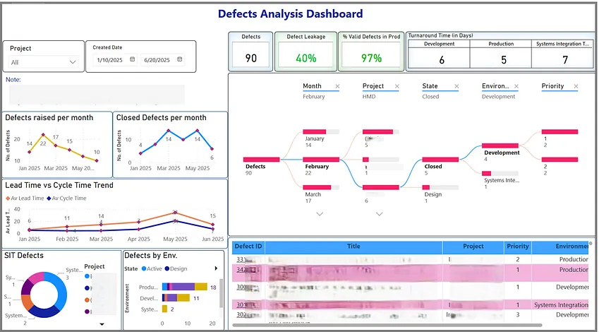
To bridge this gap, we developed a Defects Analysis Dashboard in Power BI that gives our teams and leaders visibility into key defect metrics like total defects, leakage, turnaround time, lead time and cycle time trends. This dashboard empowers us to identify problem areas, improve test coverage, and ultimately drive better product outcomes.
Purpose
In any software delivery lifecycle, defects are inevitable — but what really matters is how quickly you detect, respond to, and learn from them. Before this dashboard, defect tracking was fragmented across spreadsheets, ad hoc queries and siloed systems, leaving key quality questions unanswered:
- Are we catching defects early enough?
- Which modules are most error-prone?
- How quickly are defects being resolved?
- Is our quality improving over time?
We needed a centralized, interactive, and up-to-date solution that could surface insights in real time, and Power BI was the perfect tool for that.
A Look Inside the Defects Analysis Dashboard
Here’s a glimpse of the Power BI dashboard in action:
Key Visuals & Metrics
Total Defects Overview
A dynamic card and bar chart shows the total number of defects over selected period of time, broken down by status (active/design/in review).
Benefit: Quickly understand the overall defect volume and severity distribution.
Defect Leakage Rate
Visualizes how many defects were found in production vs. pre-production (e.g., UAT or QA).
Benefit: Helps identify test coverage gaps and improve pre-release testing strategies.
Turnaround Time
Measures the time taken from defect logging to closure. Represented as a dynamic card grouped by environment.
Benefit: Highlights responsiveness of teams and SLA adherence.
Lead Time and Cycle Time Trend
A line chart shows how long it takes to detect, start work on, and resolve defects on a monthly basis.
Benefit: Tracks process efficiency and helps spot delivery bottlenecks.
Interactive Filters
Filters for projects, dates, priority, environment (QA, UAT, Prod), etc.
Benefit: Allows users to drill down and find root causes quickly.
Benefits We’ve Seen
- Transparency: Leadership now has clear KPIs on quality without relying on manual reporting.
- Faster triage: Engineers and QA teams can focus on high-impact defects thanks to clear visibility.
- Better release planning: Product managers can make data-informed decisions about go/no-go readiness.
- Continuous improvement: Historical trend data helps us run more meaningful retrospectives.
Lessons Learned
One key learning from building this dashboard is the importance of aligning on consistent defect categorization early, particularly around fields like severity and root cause — this ensures clean, reliable reporting. It’s also essential to automate data refreshes using scheduled Power BI updates from Azure DevOps, so the dashboard always reflects the latest information. Lastly, make sure to engage both QA and product stakeholders in defining the most meaningful metrics.
Closing Thoughts
Quality is a journey, not a destination.
With our Defects Analysis Dashboard in Power BI, we now have a single pane of glass to track, analyse, and improve our quality efforts. If you’re building something similar or want to explore how dashboards can support your quality goals, feel free to connect!