
 by Savi3
In fast-moving tech environments, visibility into software releases is critical — but often overlooked. To bridge this gap, I developed a Release Management Dashboard using Power BI and Azure DevOps data.
Purpose
This dashboard is designed to give teams, platform leads and senior stakeholders a real-time view of release activity across various teams within the platform. It helps answer key questions like:
- How many releases have been deployed over time?
- How many were successful vs. failed?
- What exactly was released, and when?
Key Features
- Live Data Integration with Azure DevOps
- Trend Analysis of release frequency over days, weeks, months
- Success/Failure Breakdown to identify problem areas
- Detailed Drilldowns showing release content, owners, and environments
- Clean, interactive visuals built in Power BI with filters for team, date range, environment, and more
Why It Matters
Most organizations track releases — few visualize them well. This dashboard turns Azure DevOps data into actionable insights, improving coordination between engineering, QA, and platform teams.
It also promotes a culture of transparency, making release patterns visible to leadership without digging into DevOps pipelines.
A Look Inside the Release Management Dashboard
This dashboard is broken into four key sections:
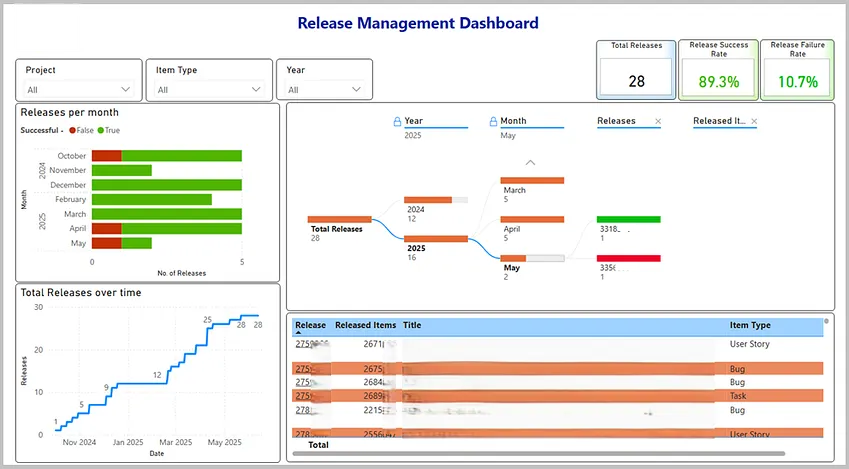
1. Release Trend Over Time
A line chart showing the number of releases over a period of time (e.g. year, month). It helps track the pace of delivery and spot gaps or surges in release activity.
2. Success vs Failure Rates
A stacked bar chart visualizing the ratio of successful to failed releases. This helps teams quickly identify reliability trends over time.
3. What Was Released?
A decomposition tree listing total releases, release year, release month, release ID, and deployed items (e.g. User Stories, Improvements, Bugs).
4. Detailed Table View
Table listing released items (along with title, type) within each release.
5. Filters and Slicers
Interactive filters by Project, Item Type (e.g. user story, bug), Year, with cross-filtering/highlighting on each visual.
Real Impact
Senior leaders now get a real-time view of our release activity. Platform teams use it to monitor trends, identify bottlenecks, and drive more informed discussions during planning.
Takeaway
If your team uses Azure DevOps, combining it with Power BI can unlock meaningful insights into your release process. This dashboard has already sparked conversations and driven improvements in our own delivery pipeline.
Curious how we built it? Reach out, or follow for more info.